Rhis-Graphics (comments)
Displaying 21 - 39 of 39 comments

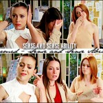
i heard they cut shannen off because she didn't get along with the other two. or is that not the case? :\
i don't know which ones i like better, i liked prue because of her spunk, lol. but i liked paige for her sarcastic spontaneity.
if that makes sense.
hells yeahh. lol.
i love charmed.
did you like it better when prue was in it or when paige was in it?
i love your default. :]
that episode too. haha.


You're Christina icons are amazing. :DDD

Hey Rhi,
I still can't PM you, so I thought I'd bring it to your profile. There are no hard feelings here, honestly. I understand that a batch rejection can be a bit rough. . .in no way do I ever reject something out of effort. I appreciate all designers who take the time to submit things, but I just try to follow the rules as best as I can when it comes to graphics. I'm sorry that you were having a rough time, but I hope things are looking up for you and you're back to designing again.
Truce?
- Whitney


Ur most welcome, I just LOVED that icon!
Keep up the gr8 work [=
What rules? Her job is not to review graphics, mine is, and I have read the rules. I am one of the most active people in the queue, so I know what to look for. I accept one out of 100 graphics I reject.
I am not going to play your pity party to get your graphics accepted. They are low-quality, accept it. Save it as a PNG because that is lossless quality.
I can also go back to reject things that have been accepted if I am allowed the permission.
Avatars and Icons:
"Minimal. A minimal or simple/plain avatar shouldn't just be a photo with/without text on it. Make it look creative and visually appealing. Don't just crop a photo! Hardly an effort goes into that at all. Some examples:"
"Colorizing. Make sure your colorizing looks nice. That it isnt tacky, too dark, or too bright/contrasted. Colorizing always makes icons look better. :] Here are a few examples:"
Dominatrix is People Staff; I am Design Staff, and she's just been helping out. I have not reviewed what she has accepted, but I had to go back to deny two things she had accepted.
It is not a matter of being fair. . .your graphics are either low-quality or far too minimal. And as for the link, you have to paste it into your browser address bar and remove the space at "forum."
Look at our Graphics Submission Guide. Your avatars/banners are usually minimal with just huge text over it to compensate for the lack of design.
http://www.createblog.com/ forums/index.php?showtopic=151 544


ReJeCTioNs??? oN THiS wEbSiTE??? .... THeRe Iz a LoTTa HaTeRs oN HeRE HAHAHA BuT YaH iM GeTTiNg B0uT To g0 0uT N TrY N FiND SuMTHiN 2 d0 HAHAHA


i LOVE all your christina icons.
she kicks ass!! "D
Add Comment
You must be logged in to comment
- Female
- 19 years old